E-COMMERCE REDESIGN
E-COMMERCE REDESIGN


PROJECT SUMMARY
A two week design sprint at General Assembly to redesign an existing e-commerce site.
MY ROLE
Competitive Analysis | User Research | Sketching | Storyboards | Information Architecture | User-Flow | Wire Framing | High-Fidelity Prototype | Visual Design
TOOLS
InVision | Photoshop | Sketch
THE CHALLENGE
People traditionally shop for bikes in person, but not always, as evidenced by "big box" stores who sell and ship. For the customer who prefers not to use a large chain, an opportunity exists for purchasing online from independent bike-sellers.
THE QUESTION
How to maintain a relationship with the user, retain individual store character, and not appear to have sold-out.
COMPETITIVE RESEARCH
These vendors were chosen as a representational mix of local, small, independent vendors. One large chain, Mike's Bikes of California, was also studied. I chose one non-bike vendor (Converse) as I felt would their site would have cross-over appeal.
BoulevardBikeShop.com
CommunityBicycle.com
Converse Shoes
CityBicycleLowell.com
MikesBikes.com
Somervelo
SuperbBicycle.com
FEATURE COMPARISON


click to view larger
BREAKDOWN OF HOMEPAGE REAL-ESTATE
COMPETITOR KEY FINDINGS
With the exception of Mike’s Bikes (a chain), and Converse Shoes (a cross-over e-commerce retailer), all of the shops were based in one location.
The locally based bike shops place less emphasis on selling
The independent sites look more urban and captures a greater sense of zeitgeist
The information architecture on the four local stores is less streamlined
USER RESEARCH
Three avid cyclists were interviewed to discern:

- What type of cyclist they are
- When and why they engage with bike shops online
- Their expectations from an online bike shopping experience
The overwhelming key finding was the sense of community biking creates.
From their sellers they were seeking:
Knowledge of their products
Trust in their recommendations
Forming a relationship with their bike store
USER PERSONAS
click to view larger
click to view larger
PROBLEM
"As a cyclist, I want to find quality biking products from an
online source who is invested in my community, so that I can
forge a long lasting relationship."
SOLUTION
"Our online store is for cyclists of all ages, seeking customized service, quality merchandise, and knowledge from a trusted team. With 35 years invested in the biking community, we're here for you: from the purchase of a new bell, to a new bike."
STORYBOARD: Eli and Emma
click to view larger
THE EXISTING WEBSITE
Click to view larger
Some of the key issues with the website were it's cascading navigation which proved challenging with a mouse or a trackpad. The navigation was heavy with many categories, some of which were consolidated for the redesign.
The site does not have a shopping cart or online checkout, but does display ample merchandise which can be ordered into the store or by phone.
Many of the pages were heavy with text and images. Some nice features such as their personalized bike selector service, and bike tips were hidden far down a scrolling page.
REDESIGN STRATEGY
click to view larger
Many of the qualities that the users placed strong emphasis on, were already part the website, but hard to find. These were brought to the forefront on the homepage: features such as bike tips , an upcoming 35th anniversary, and their personalized bike-finder service.
The goal was to establish a clean, classic look, straightforward and uncluttered and create a commerce site that did not scream “buy me!”
The logo redesign drew inspiration from the Coca-Cola and Raleigh Bike logos.
The page layout design was sourced from the children's educational book series by Dorling Kindersley, some of the austerity of Chanel's advertising campaigns, and the logical layout of swiss design.
I also viewed vintage art nouveau and art deco bike posters to gather a wider field of reference.
SITE MAP
The information architecture for this site was somewhat vast (for a first stab at IA) as there were lots of products and categories in search of a home. Site map and footer map below:
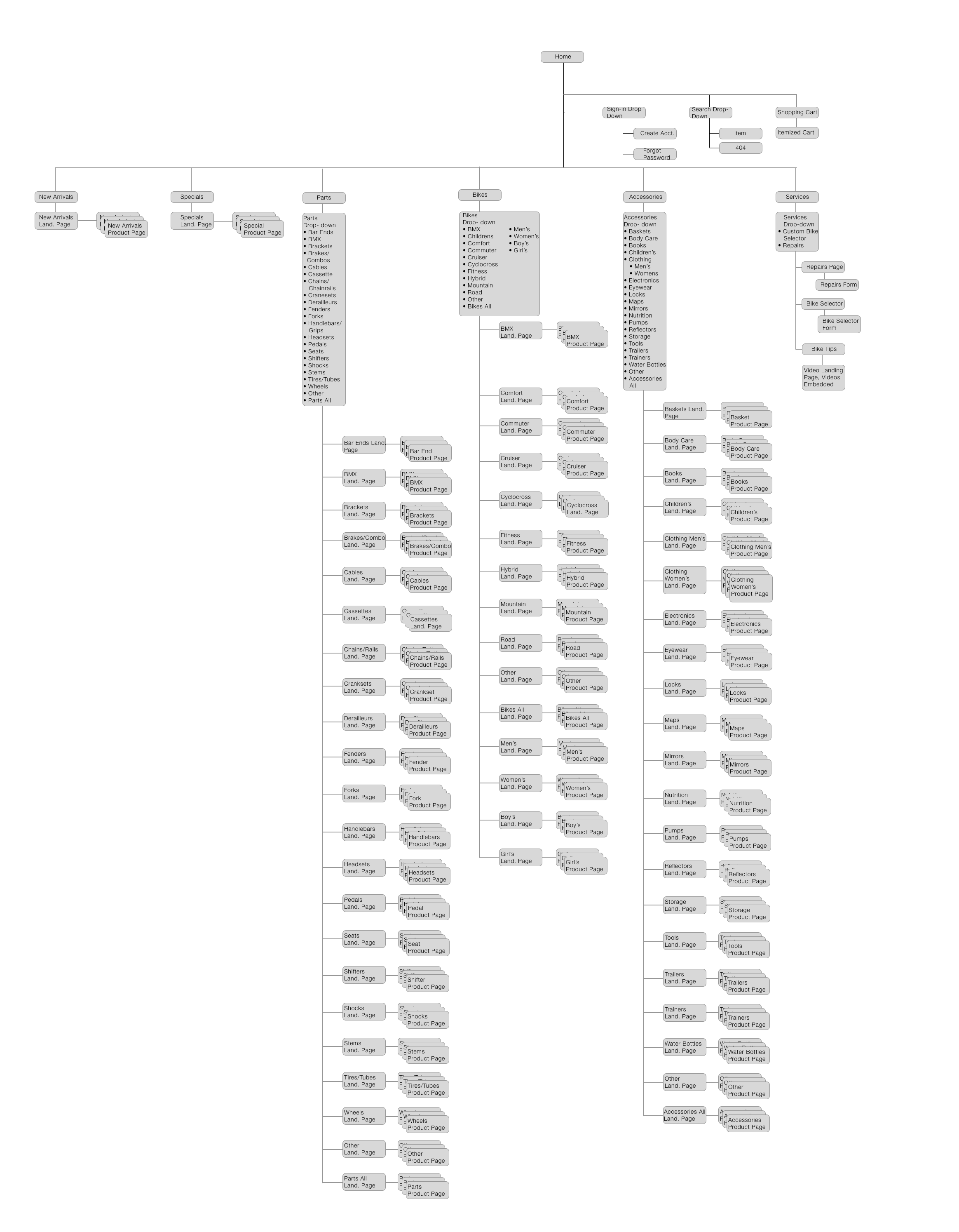

click to view larger
USER FLOW
The task flow progresses from entering the site to the selection and purchase of a girl's bike.

click to view larger
WIREFRAMES
click to view larger
WIREFRAME INTERATIONS
click to view larger

NEXT STEPS
Further develop the rest of the site, all pages, and the check-out process
Create a mobile version of the site
SUMMARY
The redesign of Frank’s Spoke n’ Wheel, was something of a challenge: how to create a more commercially accessible site, while devising a design that was subdued and non-commercial in appearance.
This directive would have be been unknown without the input of the users, who displayed a distaste for the overtly corporate, and desired an on-going relationship with their seller in person. Drawing upon the inspiration of children’s educational books and clean graphic design, the goal was to create a look that is intelligent, accessible and familiar, with the hope of instilling a sense of trust in the user.