MUJI
MUJI REDESIGN
A clickable prototype of the desktop and mobile site is available through Adobe XD.
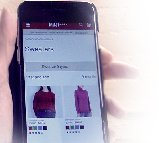
The task: Add a women's XL pink cashmere turtleneck sweater to your shopping bag.

PROJECT SUMMARY
I partnered with UX Designer Christine Giraud (http://www.christinefgiraud.com) to redesign the MUJI desktop and mobile sites.
MY ROLE
Competitive Analysis | User Research | Ideation | Sketching | User Persona Creation | Storyboards | Low-Fidelity & High-Fidelity Wireframes
WHY A REDESIGN?
In a word: simplicity. MUJI is a Japanese home goods and clothing store featuring their "brand-less" brand and minimalistic aesthetics.
The decision to redesign was based on user responses to a visually and linguistically confusing site, missing many of the standard features that are now part of e-commerce.
THE USER'S PERSPECTIVE OF MUJI.COM:
"I don't know what this store is about."
Here is a video walk-through of the existing MUJI desktop site and comments
Five users were asked to examine the current website. Their chief pain-points and the key takeaways were:
Unclear Identity: Who is MUJI? What is MUJI? Upscale or budget? One-stop shopping or niche?
Confusing Imagery and Page Design: Pages lacked visual appeal; sought flattering images of products
Lost in Translation: Unusual word choices for categories and spelling errors
Poor Search Capabilities: Several users had confusing results to a simple search, and experienced links that would misdirect them
COMPETITIVE ANALYSIS
A collection of stores which focused on home goods and/or clothing were studied, most notably:
- Target
- L.L. Bean
- Urban Outfitters
- Primark
- Franc Franc
- Uniqlo
- IKEA
- H&M.
Some features missing from MUJI which users felt would improve the site were:
- Recommended Items based on purchase history
- Reviews and Ratings
- Ability to purchase Gift Cards
USER FLOWS: CURRENT AND PROPOSED
Goodbye to the multi-step entry: Currently, users are directed to the international version: MUJI.com.
If the user selects a country (example the US) they are directed to MUJI.us which showcases a MUJI site but doesn't permit shopping. The user then must choose "Online Store" to enter the e-commerce version of the site.
To simplify, a landing page was proposed where the user can chose a country and then be directed to the correct e-commerce site, eliminating the current intermediary site with no e-commerce capabilities.
Existing User Flow created by Christine Giraud
A Proposed User Flow created by Christine Giraud
USER PROBLEM STATEMENT
“I want an attractive e-commerce site with a clear identity that offers a predictable shopping experience so that I can make purchases easily and feel enthusiastic about the store.”
SOLUTION
“Muji.com offers an e-commerce experience which clearly defines our identity, is easy to use, with the goal of converting users into brand evangelists.”
USER PERSONA

STORYBOARD
IDEATION
From the initial sketches it was determined that A/B testing would be necessary for the site navigation. The two styles presented: top navigation vs. a drop down hamburger menu.


ROUND 1 ITERATIONS
The first iteration of low-fidelity wireframes included an A/B test for site navigation styles. The users were presented with the task of buying a sweater.
The users preferred a horizontal top navigation (A), instead of a hamburger menu (B).
Version "A" navigation, preferred
Version "B" navigation
They also requested
- A filter for customer ratings and prices
- Add social media buttons to the footer
ROUND 2 ITERATIONS
The second round of testing used a high-fidelity version of the desktop site. Implemented were the user requests from the first round. Addition "wishlist" requests included:
- Add In-store Pickup
- More specific product descriptions
- Gift Cards and a Rewards Program
- Better formatting of the home page so the scroll did not cut off imagery upon landing
NEXT STEPS
The next steps to benefit the further development of the desktop and mobile sites would be:
- Testing of the mobile site with users
- Develop the site more fully and add gift card purchasing capabilities
- Offer item recommendations based on purchase history
- Further refine the site
This preliminary design phase accomplished a short-term MVP creating a site that is easier to navigate and comprehend, and conforms visually with current best practices and design trends.
