PARACHUTE TEACHERS
PARACHUTE TEACHERS
PROJECT SUMMARY
As part of a team in a three week design sprint, we were challenged with redesigning the online profile and application process for Parachute Teachers.
WHAT IS PARACHUTE TEACHERS?
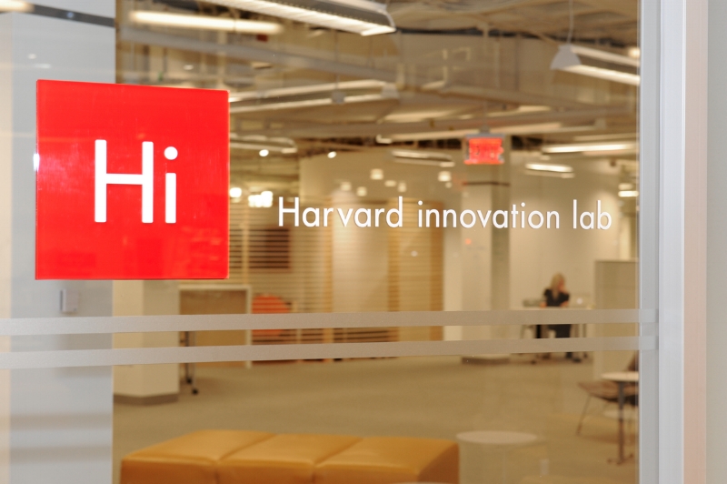
Based out of Harvard Innovation Lab, Parachute recruits, screens and trains members of the local community – yoga instructors, dancers, photographers, chefs, scientists, and engineers to be substitute teachers .
MY ROLE
Competitive Research | Contextual Inquiry | User Research | Ideation | Style Guide | Wire Frames | User Flow | Information Architecture | Animation| Presentation
THE CHALLENGE
“When I applied to Parachute, it was very personalized. How do you scale and stay personal? I’m not sure how they will do that. ”
Currently, a high number of potential teachers do not complete their application. This is due to the many documents required by their partner, Boston Public Schools.
Parachute also wishes to scale their model, allowing teachers to choose from multiple districts as they expand.
RESEARCH
The existing website (see video below) consists of a single scroll with buttons taking the user to third-party sites.
CONTEXTUAL RESEARCH
Contextual research was conducted on four participants. Key findings included:
There was too much information to take in
The site is text heavy and formatting is unclear
They wanted more guidance and visual cues
COMPETITIVE RESEARCH
We looked at the competition in three different ways, considering:
- Agencies for substitute teachers
- Sites or softwares with long form or application processes
- Sites with online profile creation
KEY FINDINGS:
Applicants are directed externally to complete school applications
Users receive the support of prompts, progress bars and clear instructions
Users are clearly informed when taken away from host site
Profile sections that are parsed by subject heading
FIELD RESEARCH
We interviewed five Parachute Teachers at the McKay School in East Boston.
KEY FINDINGS:
No confirmation after screener submission
Next steps unclear after completing screener
Wanted a strategy for gathering documents
KEY TAKEAWAYS:
The users expressed these needs:
Sought a relationship with Parachute
Wanted a simplified process
Preferred visual cues for reassurance
"I really wanted more information at the beginning. I get it now, but I was a little confused the beginning."
-A Parachute Teacher
USER PERSONA
JOY'S STORY
Storyboard: KYLE CARBONE
THE PROBLEM
“As a prospective educator, I want a streamlined way to apply to schools and create an online presence with Parachute, so that I can quickly and efficiently complete the requirements to start teaching.”
THE SOLUTION
“Parachute provides prospective educators with a streamlined and intuitive application experience. Users are able to choose their districts, create a comprehensive profile and apply to schools. The guided experience leaves users feeling at ease and ready to teach.”
IDEATION
During the ideation process two key transformations for the site emerged:
1. Have the on-boarding process, and profile creation reside in the user's account page
The purpose: to consolidate, and streamline the process.
Allowing the user to start their Profile while working on their application would create a greater level of commitment.
Storyboard: MACY LAWRENCE
2. Create an Informational Animation that explains the application process
The animation provides reassurance for the user as they begin the lengthy application process.
As Parachute continues to grow, personal contact with the user will become more infrequent. An animation provides a welcoming voice for the company.
OVERVIEW ANIMATION
Animation: MACY LAWRENCE
SITE MAP & USER FLOWS
KEY ITERATIONS
PROFILE PAGE ITERATION 1
PROFILE PAGE ITERATION 2
OVERVIEW ITERATION 1
OVERVIEW ITERATION 2
SCALABILITY
FAQs & CHECKLIST
SCHOOL FORM
NEXT STEPS
Our team considered these to be the best next steps:
Confirmation email: after completion of school forms for user reassurance
Mobile version: for users to update their profile, and review prerequisites
Notification center: to be alerted about new openings, reviews, news and requirements
History section: leave notes about teaching experiences in each school
Photos: sharing photos will showcase the users skills
SUMMARY
The greatest lesson learned from this project was adaptability. The late introduction of adding a scalability feature had us utilize Agile methods to facilitate this request in time for the client presentation. Streamlining many flows was something of a challenge, but the result is a more cohesive experience for the user. The client's satisfaction and their enthusiasm for rapid implementation, was, of course, the best possible outcome.


